The biggest update to Squarespace web design tools for the first time in 10 years.
Lead Product Design, Visual Design
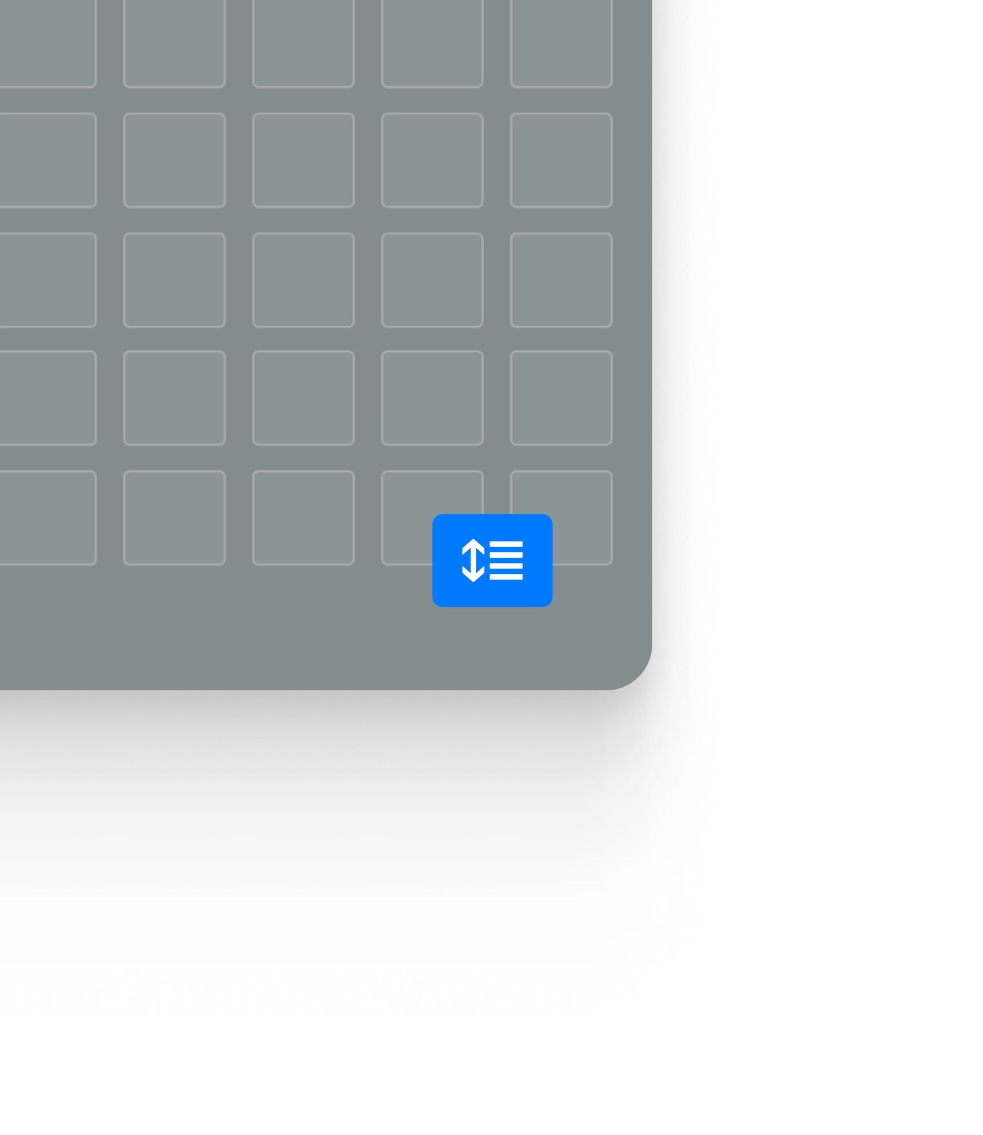
Guided by an advanced smart grid, Fluid Engine provides users with maximum freedom to easily play with, experiment and stretch creative limits through an unrestricted canvas. Regardless of how you experiment with Fluid Engine, our guidelines and design system will ensure that your website looks good no matter what.
Fluid Engine is the most design-forward, yet simple and fast way to build a website, with millions of people creating business and personal brands online, we have created a simplified solution – it's as easy as building a presentation and the output is incredible.
In my role, I oversaw the initial conception and ideation of the product, to the final handoff and market release. As one of two designers on the product, I focused on the visual design, expressibility features, accessibility and onboarding to create the ideal user experience. Touching all aspects of the product, I helped set the roadmap for MVP and future releases to ensure all users, would understand the new system.
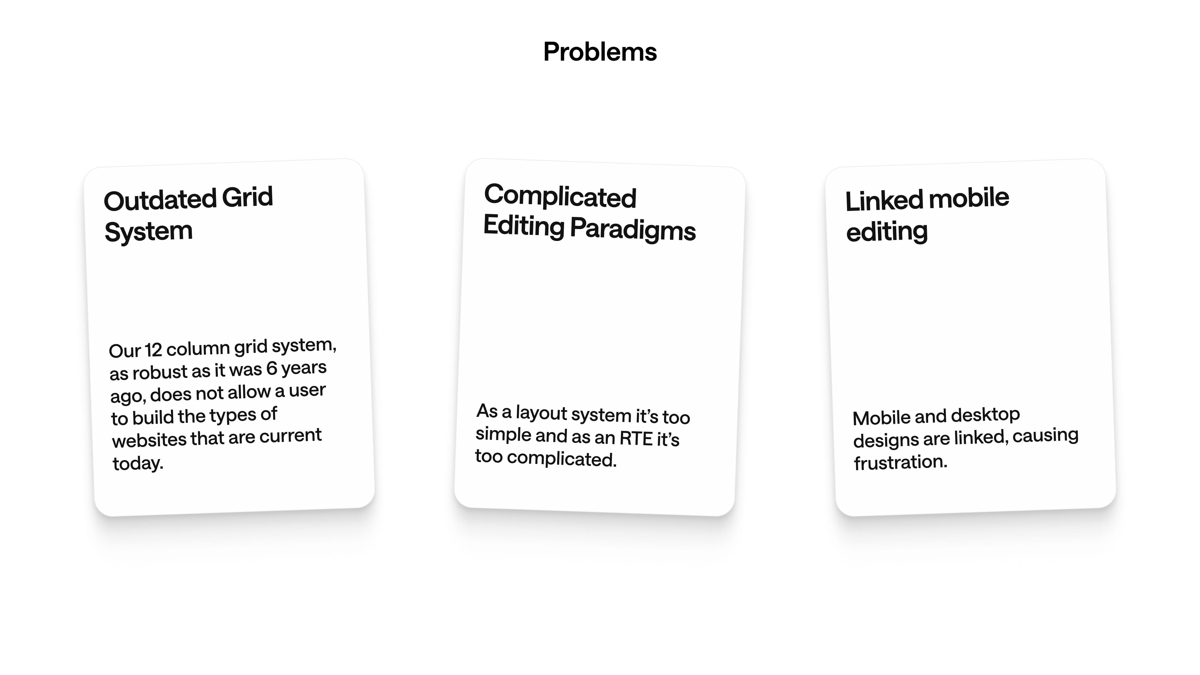
The Challenge
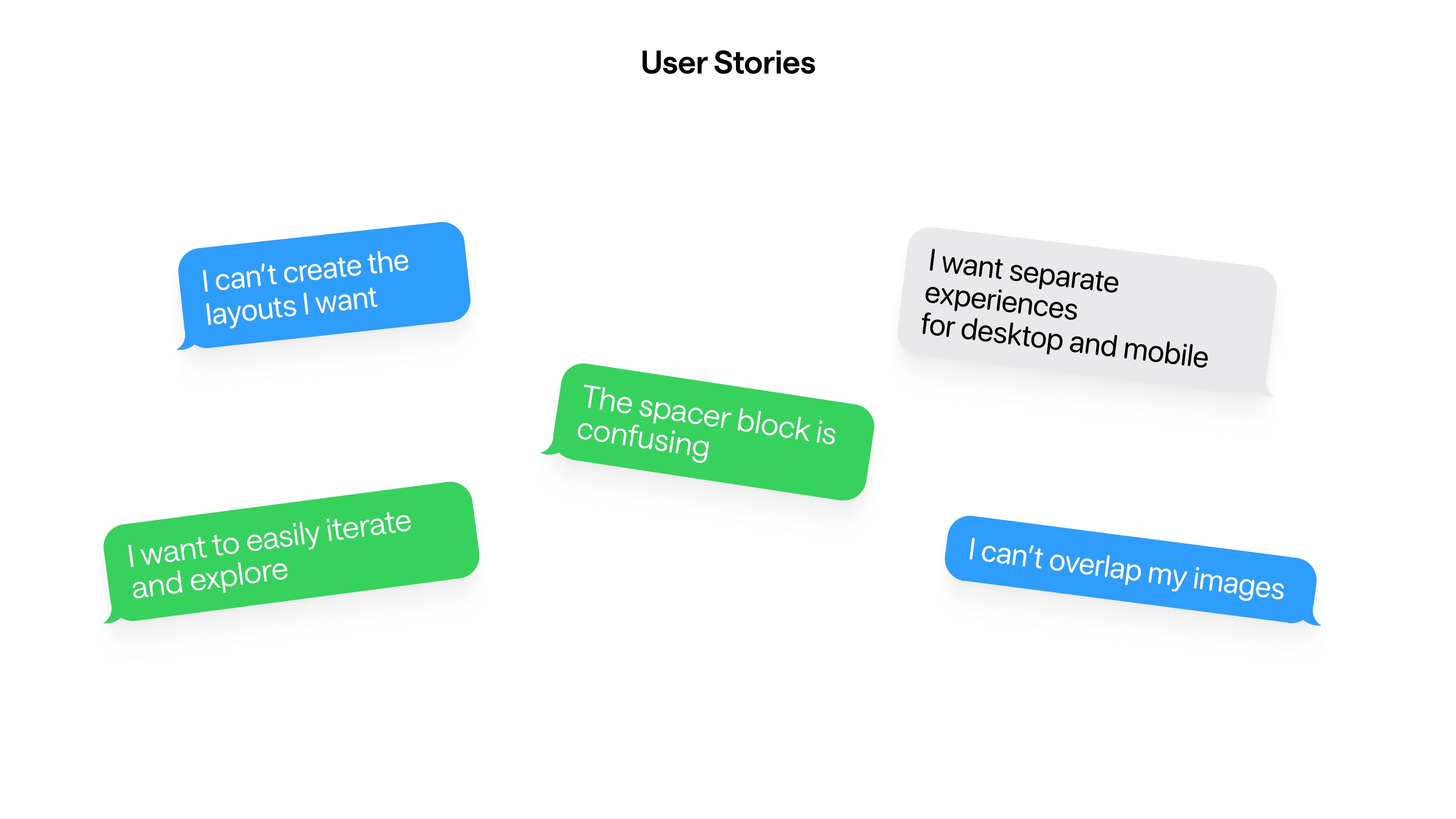
"An editing system that balances ease of use with expressibility"- Eric Song
Discovery and Exploration
Evolution
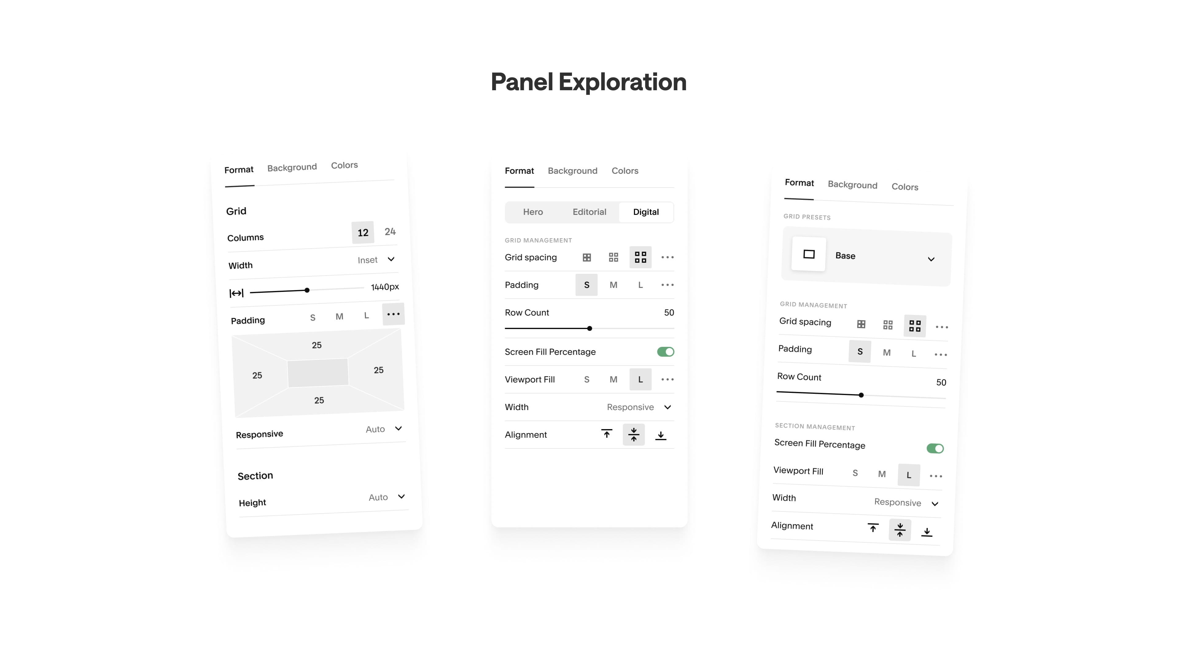
How is the grid interacted wtih?
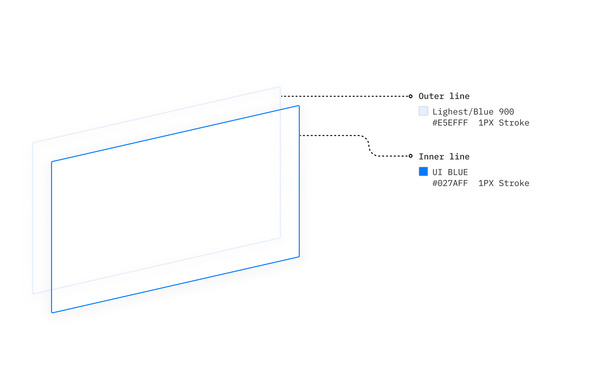
Ensuring Accessibility
In a collaborative effort across divisions, we partnered with Squarespace experts to ensure that Fluid Engine had accessibility baked into the product from its conception. We achieved this by developing all of our UI elements with a double stroke around their border, a visible grid regardless of background colour, and a contextual background. The final of which was key. It ensured that the elements not only felt like part of their section, but also gave elements - particularly text - a background that would always be visible on the grid.
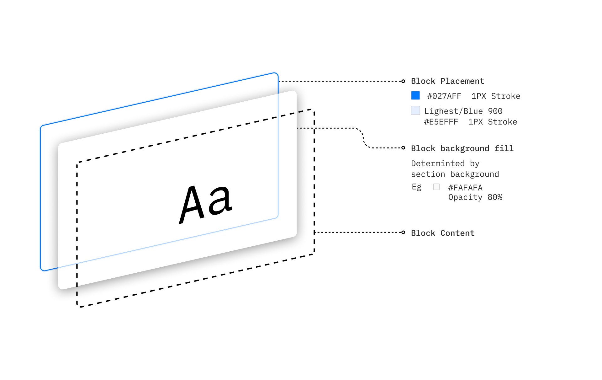
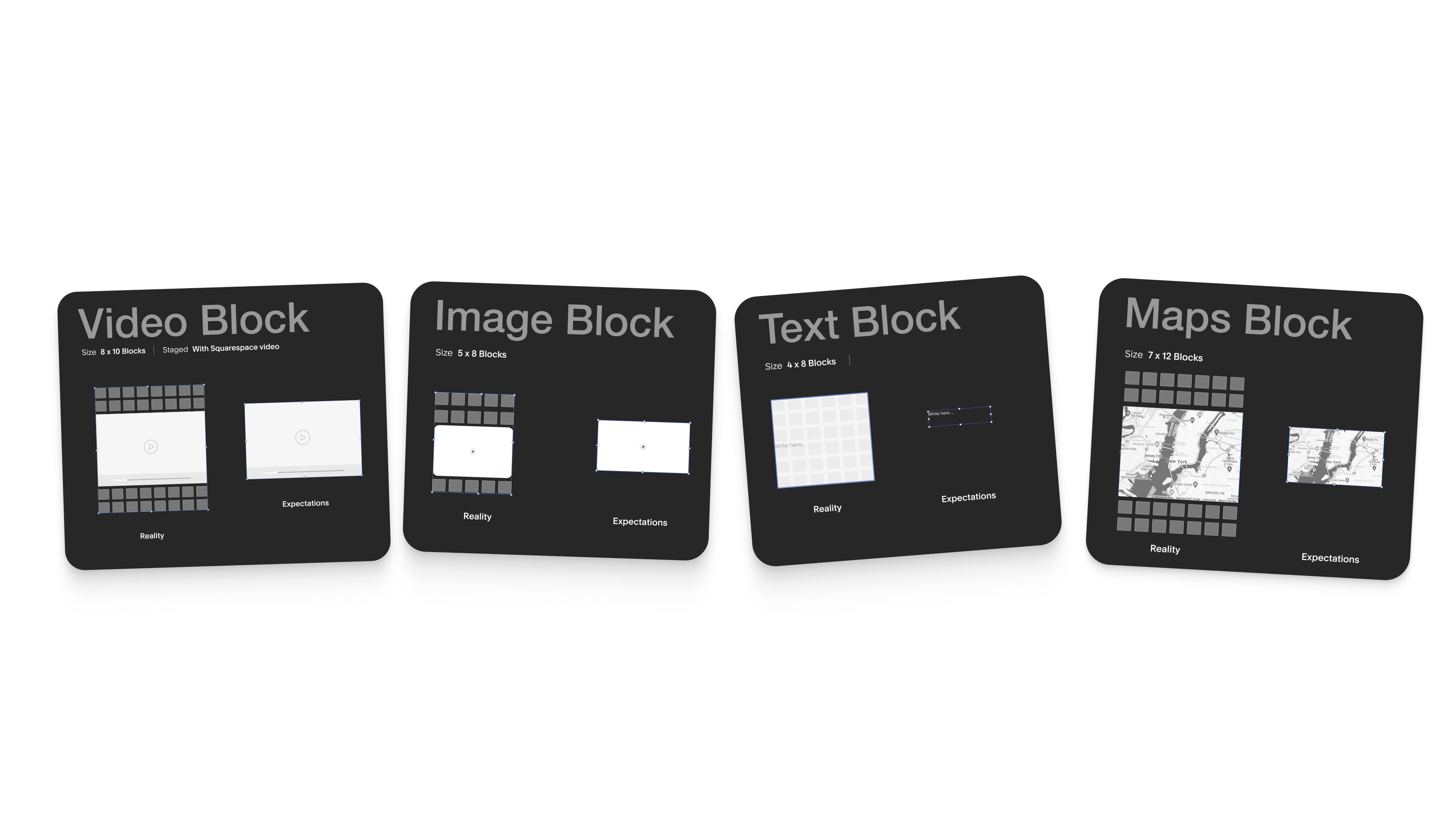
Contextual Content
To make the content feel like it was all from one place, we developed contextual backgounds on text elements. This not only ensured accessbility, but also that when you picked up content, it felt like it was all from the same place.
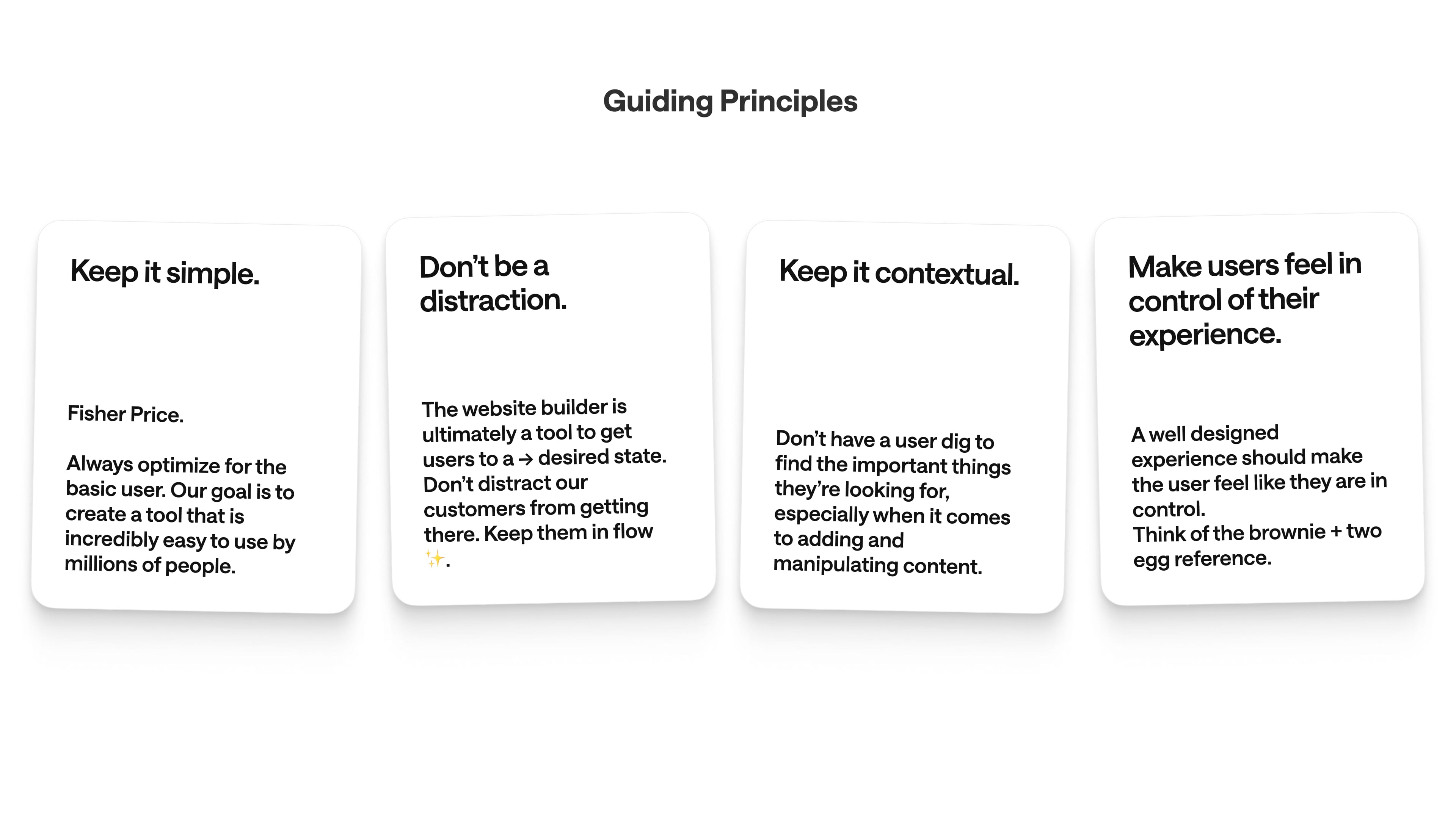
Guided By Design
Holistic Updates
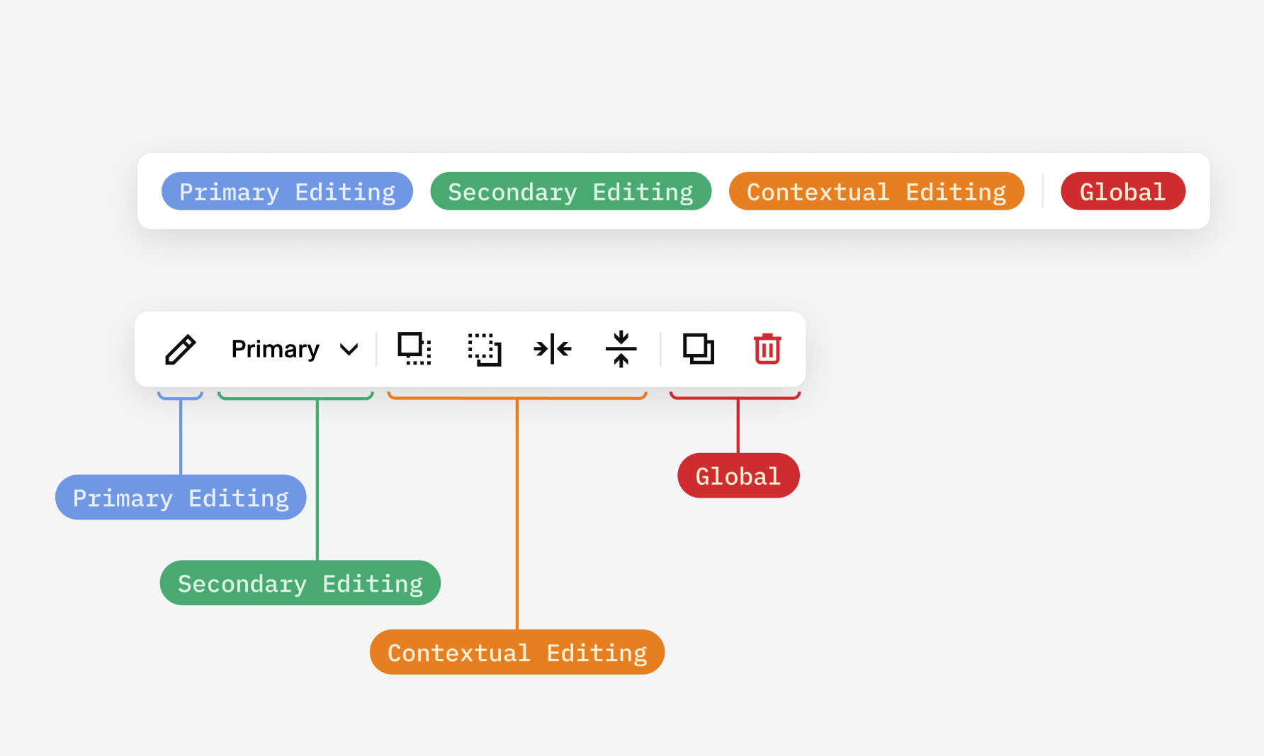
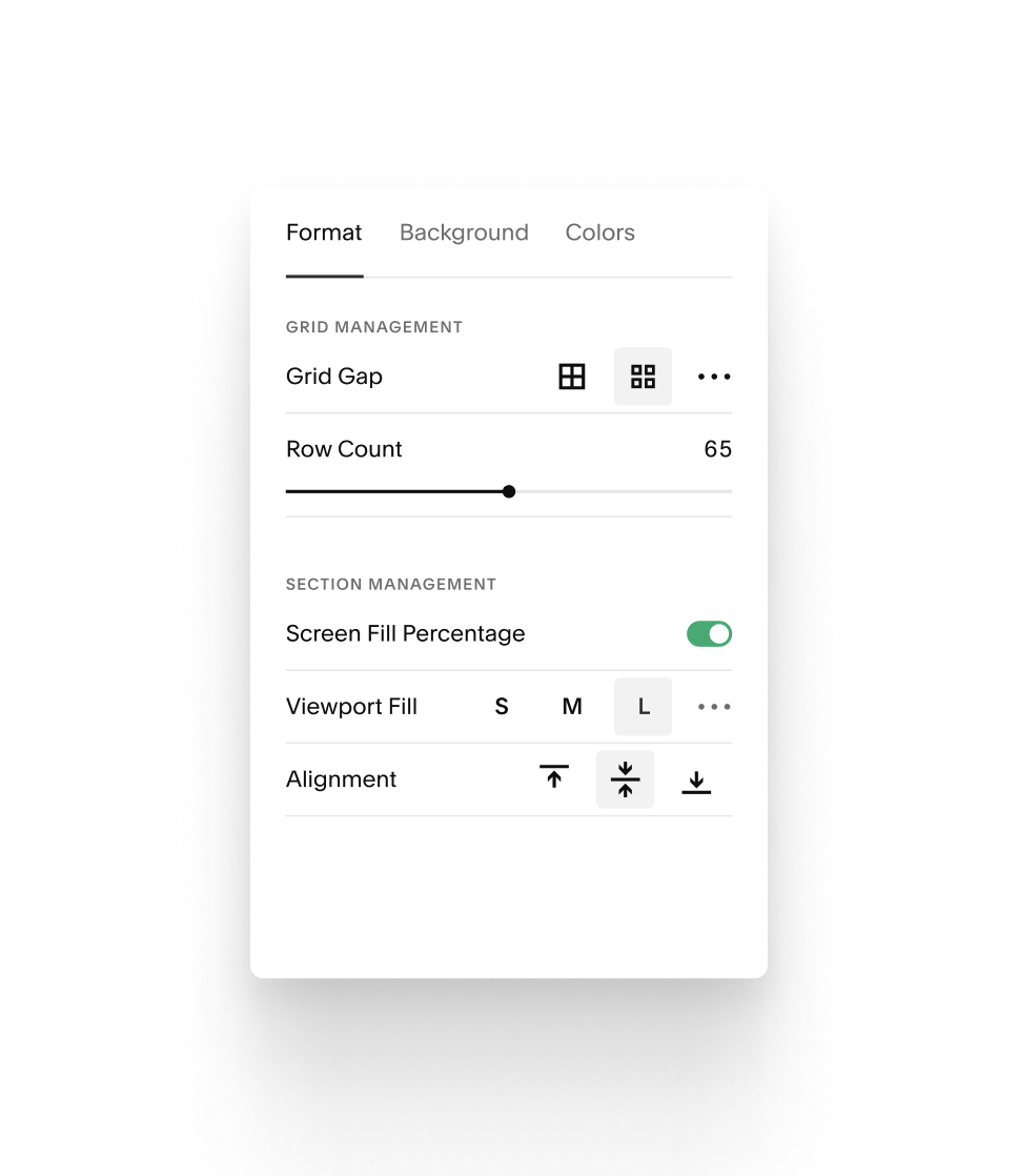
Defining rules
By ordering our annotation bar in a way that gives a strong structure we allow our users to quickly edit their content seamlessly.As these blocks were also treated on a case-by-case basis, their needs and edibility are different. Such as set and forget layouts. Giving them this strong ordering allowed for a global system rule to be created and followed.
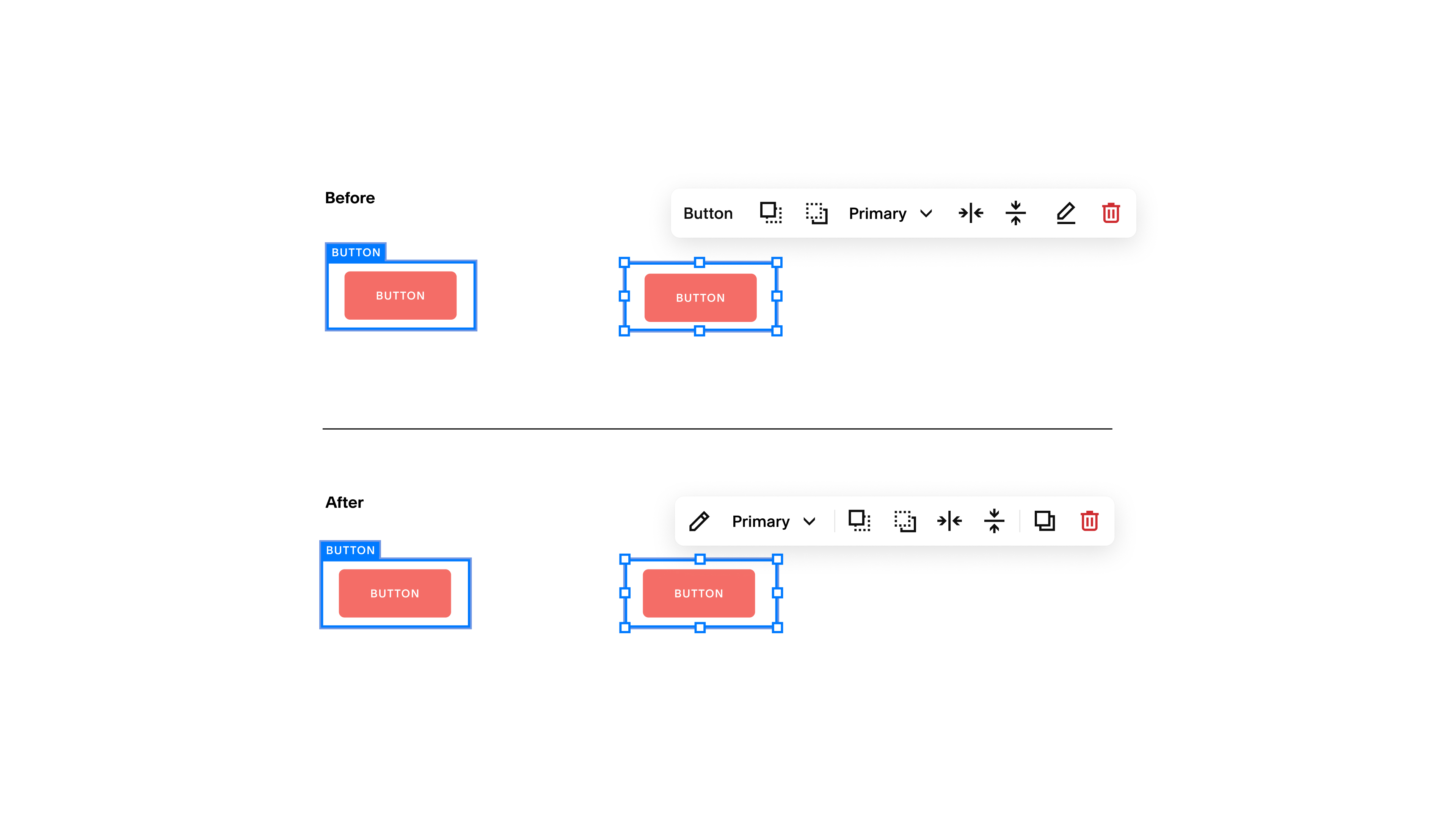
Updating our system
Onboarding

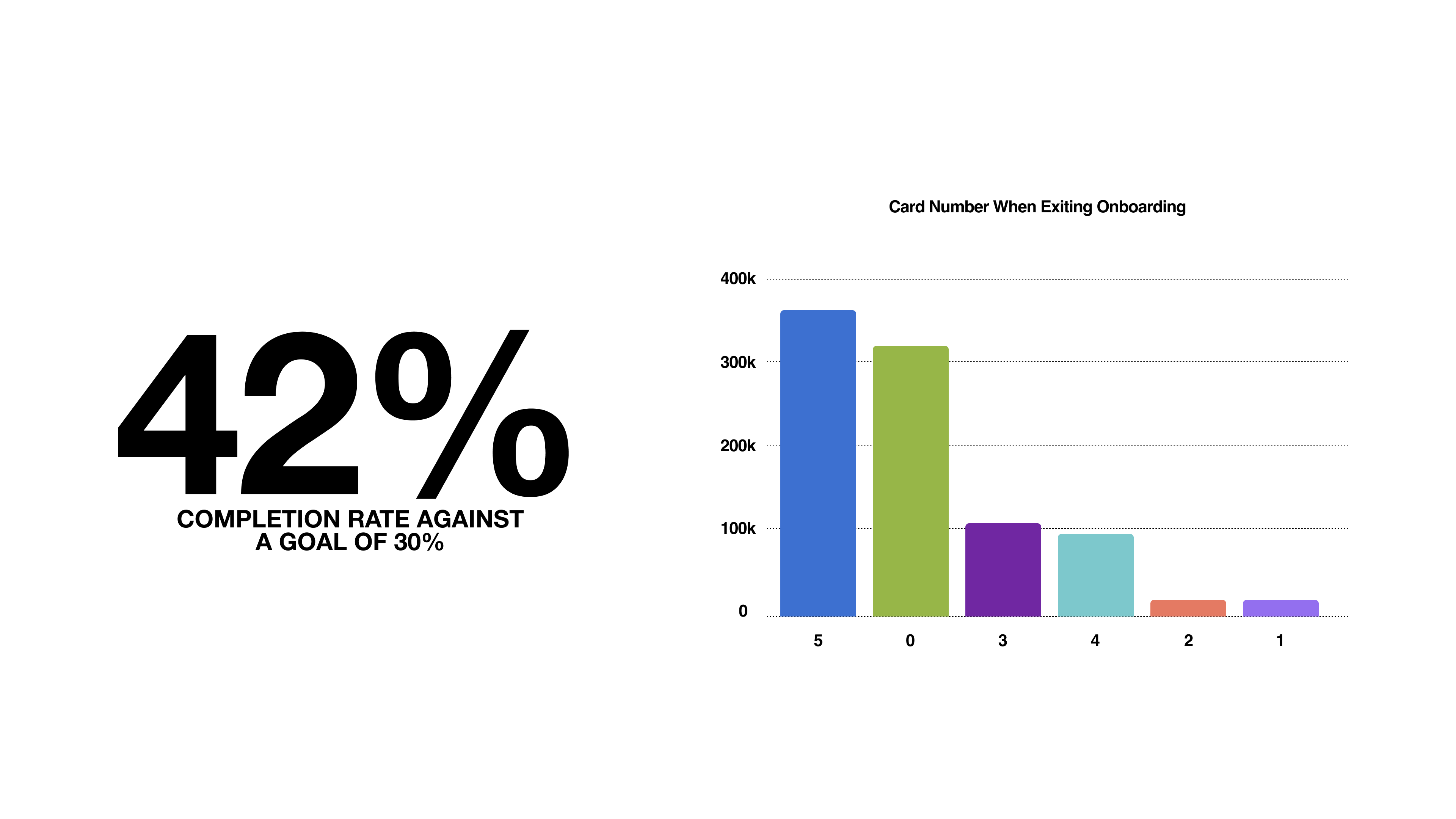
Roll out
Fruitful App
Stop worrying about your finances. That's our job.
Gemini
The most general and capable AI models Google has ever built.